Works
Works
From concept to launch — projects that helped startups grow, scale, and succeed.
Umi Sushi'S
Forget “less is more”, sometimes more is magic. Umi Sushi is my take on controlled chaos: a detailed, hand-crafted logo full of texture and movement, balanced by clean visuals and bold, unapologetic color. The logo draws inspiration from traditional Japanese woodblock printing rich in strokes, organic forms, and imperfect beauty. The sushi illustration carries a sense of handmade authenticity, while the chopsticks slice through the frame, adding motion and rhythm to the composition. The typography is tall, confident, and modern standing strong against the chaos, much like the discipline behind Japanese craftsmanship. The contrasting color palette of vibrant coral red, soft beige, and lively green mirrors the essence of sushi itself freshness, boldness, and balance. It’s sushi branding, but make it art.
Dabara Set London
Our Vision is clearly to create a space where people get to have an experience on the artistry behind every drop of south indian style coffee while at the same time fostering a deep appreciation for its old history and ways of preparing it. Our strong mission is to provide an essence and the blend of taste,tradition and educate people , making each visit a memorable Journey into the world of South India coffee craftsmanship.
Brand Design
Synk Bags
SYNK has be brought at this intersection of luxury aesthetics, personalization, environment, responsibility. As we all know that man brand emphasises more on their branding,status and designing part which is also considered to be the core of the brand but quality and, ethical materials and givinig the consumers both voice and choice. Though the branding is still stuck in its conceptual and prototype stage, this whole research helps to plan the strategy on how to plan and develop the brand and its product range, brand identity, customization and all the sustainable practices. It can also be called as a blueprint for SYNK for not just existing today, but for where the brand is aiming to be, forming meaningful connections through designs, fashioning and telling each bag a story and what redefining what accessible conscious luxury can mean.
Brand Design

Nomu
The packaging design for Nomu, a cutting-edge energy drink, is a harmonious blend of subtle sophistication and vibrant energy, all wrapped in a contemporary Japanese-inspired aesthetic. The name "Nomu," derived from the Japanese word for "drink," captures the brand's ethos of vitality and elegance.
Crickstart
We are developing a unique prebiotic drink infused with cricket protein and enriched with pea protein, hemp protein, and soy protein. This beverage is designed for environmentally conscious consumers aged 18-40 who prioritize health and sustainability. The product offers five fruit flavors to enhance its appeal and taste, making it an attractive choice in the prebiotic drink market.
Brand Design
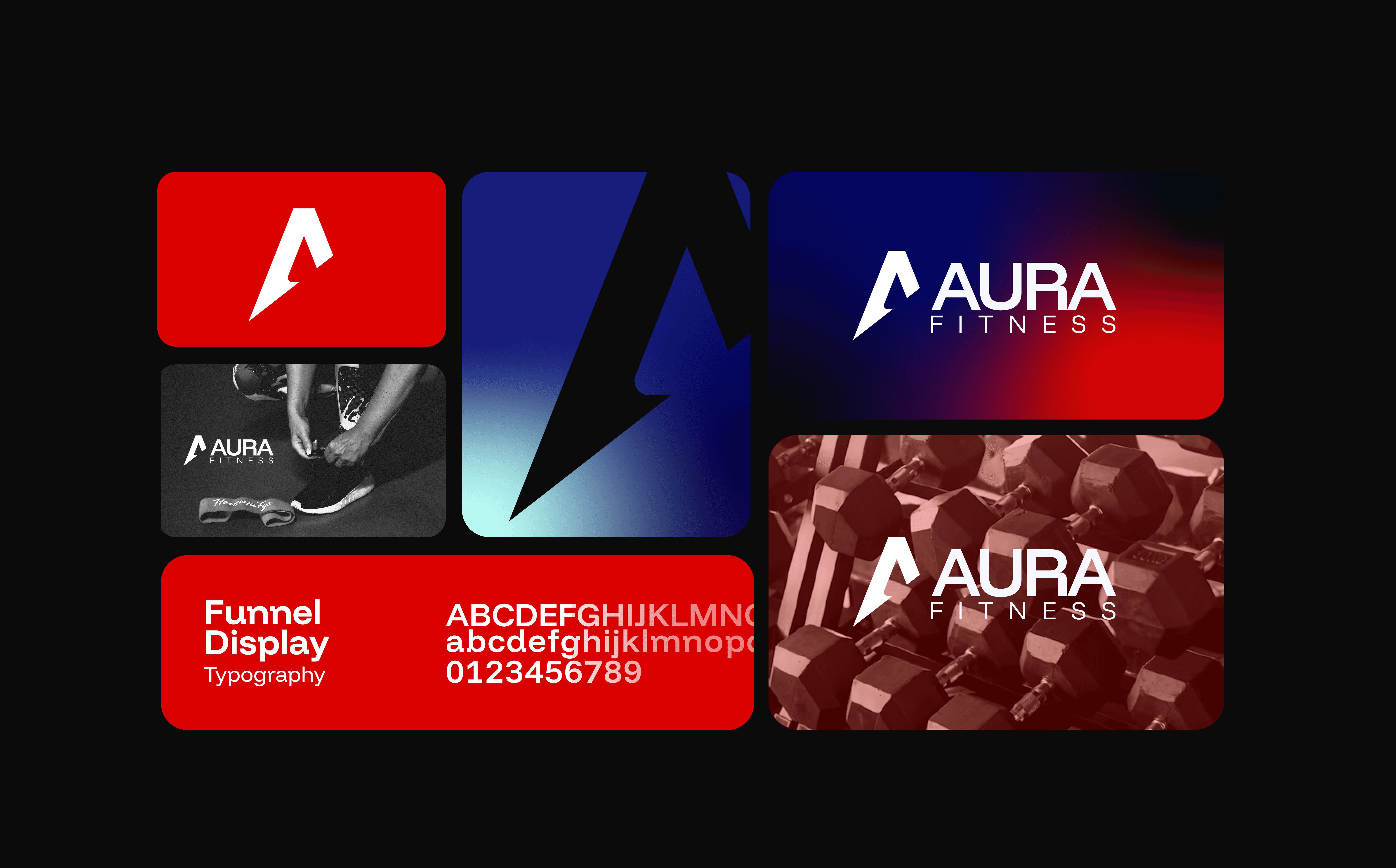
Aura Fitness
AuraFitness is a dynamic, unisex fitness brand that fuses strength, community, and individuality. Our mission is to create a fitness experience that empowers individuals of all backgrounds and fitness levels to come together and reach their full potential. Whether you're a beginner or an athlete, we believe in progress, not perfection, and that everyone should feel part of a stronger, supportive community. We go beyond just gym equipment and fitness classes-we're committed to building a lifestyle brand that integrates high-performance fitness with exclusive, stylish merchandise. At Aura Fitness,, we aim to make fitness feel personal, fun, and inclusive
Visual Design
Brand Design
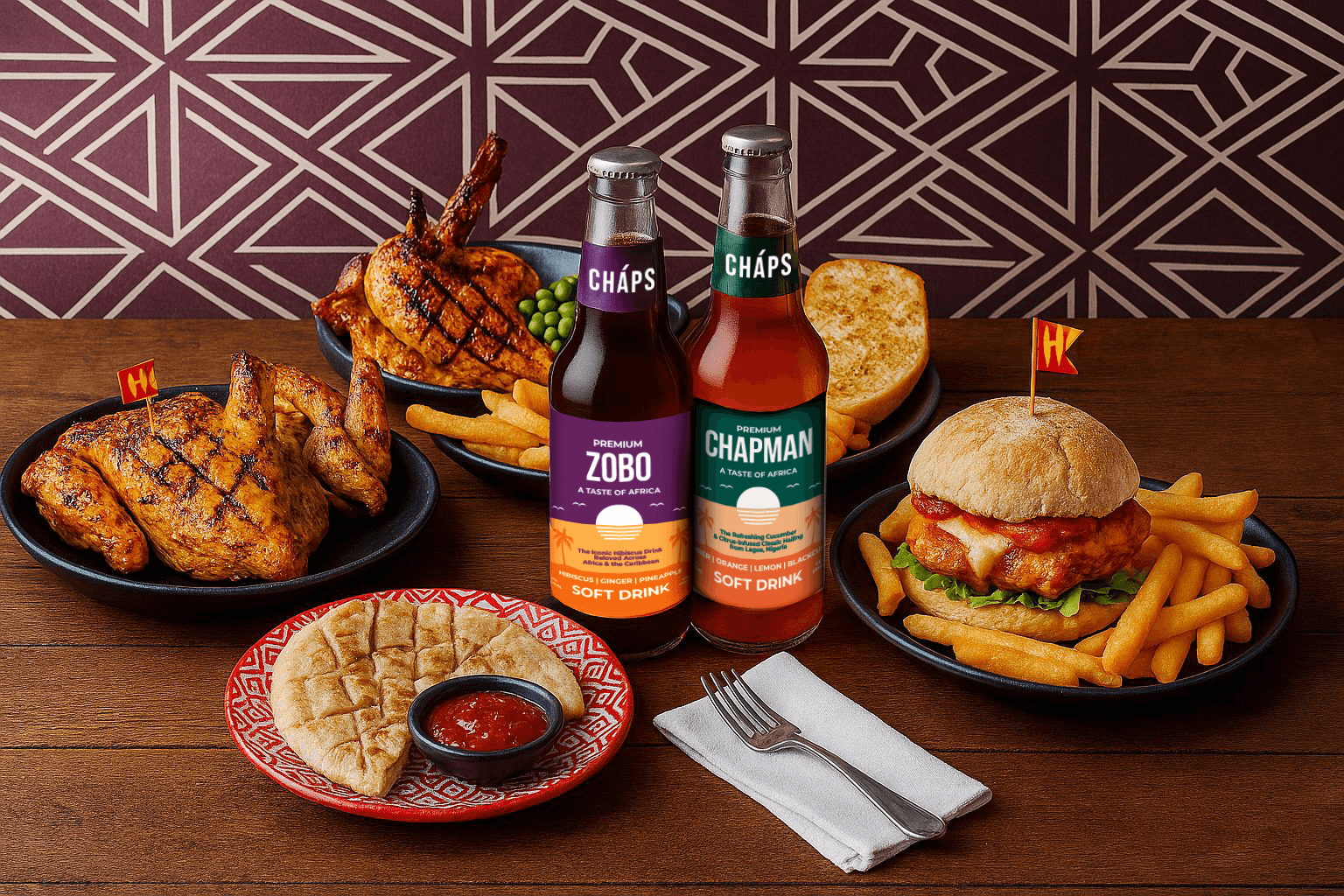
Chaps Beverage London
Cháps is a pioneering soft drinks brand dedicated to introducing beverages inspired by traditional African drinks to a global audience. Our mission is to bottle the unique flavors, rich heritage, and good vibes of Africa, bringing a taste of African culture to new audiences by creating memorable experiences through our beverages.
Visual Design
Ready to build something amazing?
I'd love to connect with you!
Ready to build something amazing?
I'd love to connect with you!
Ready to build something amazing?
I'd love to connect with you!