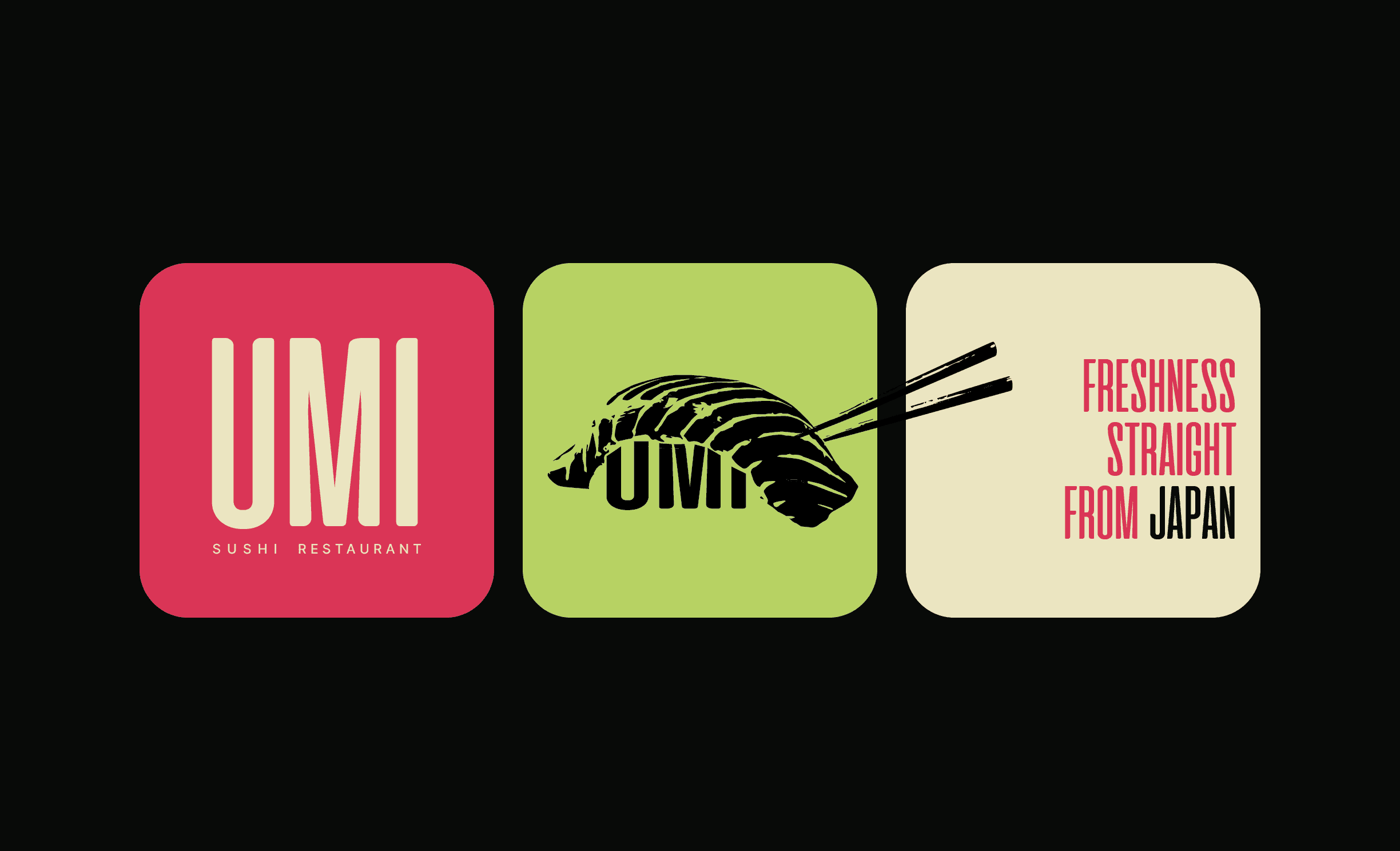
Umi Sushi'S
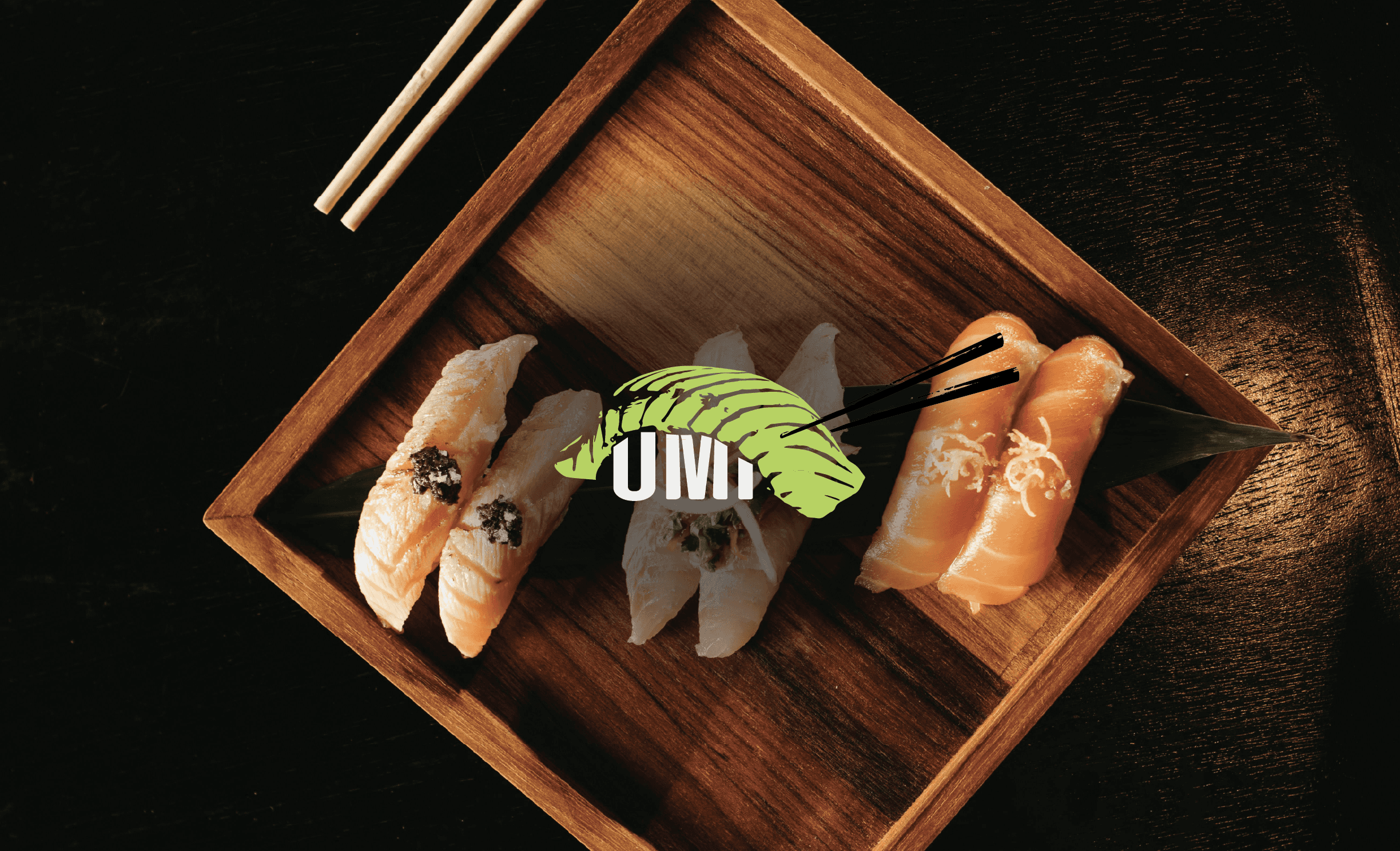
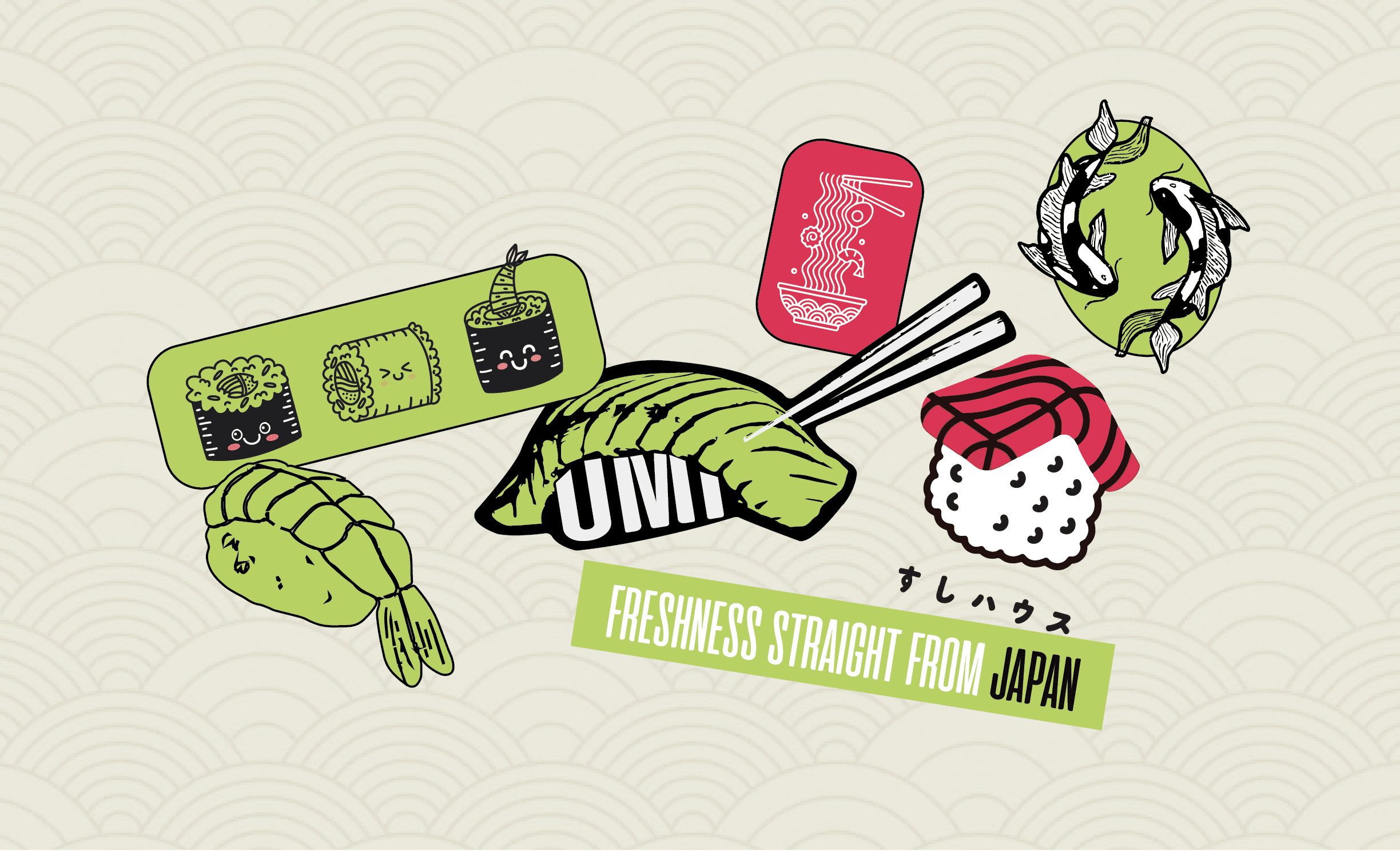
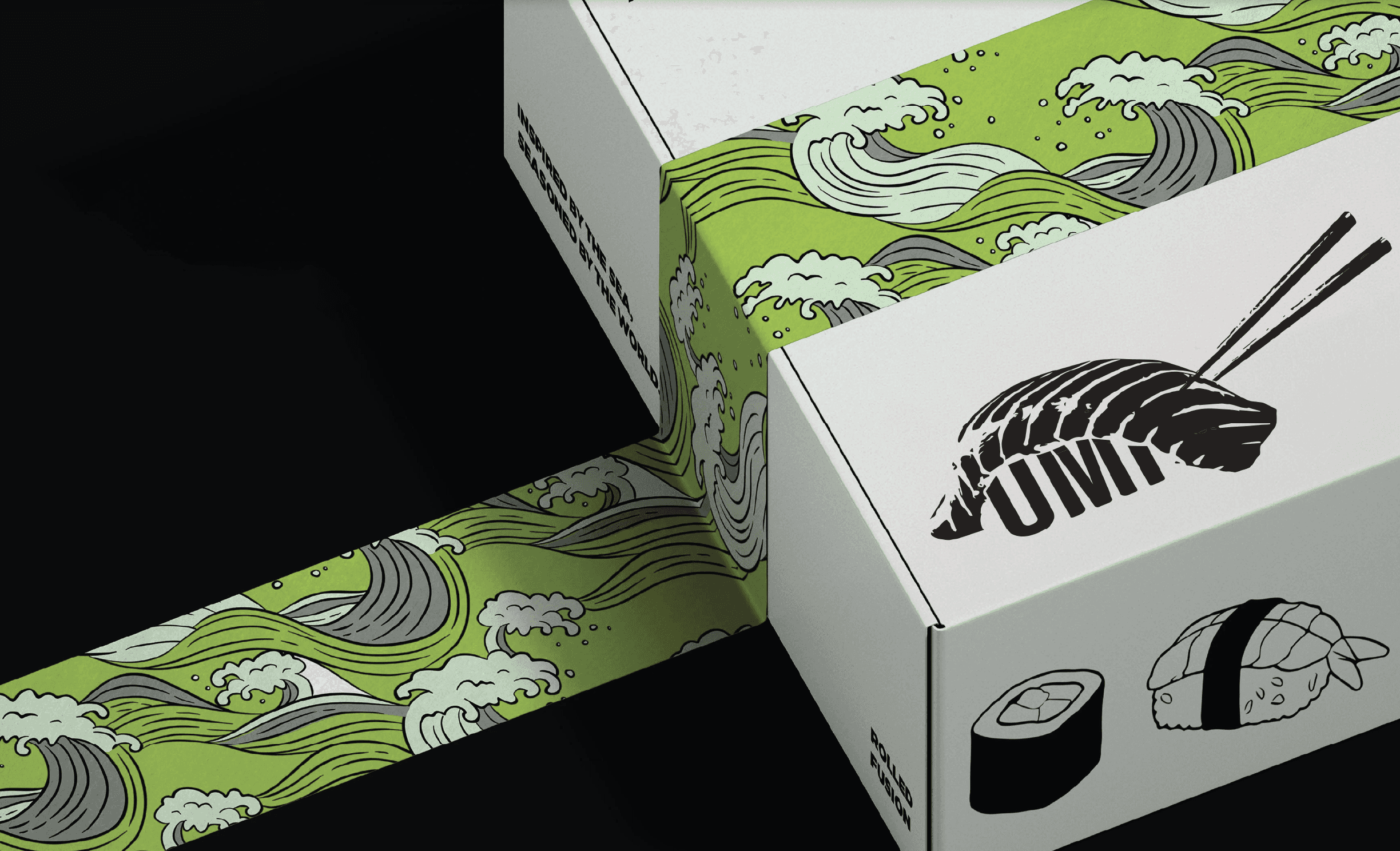
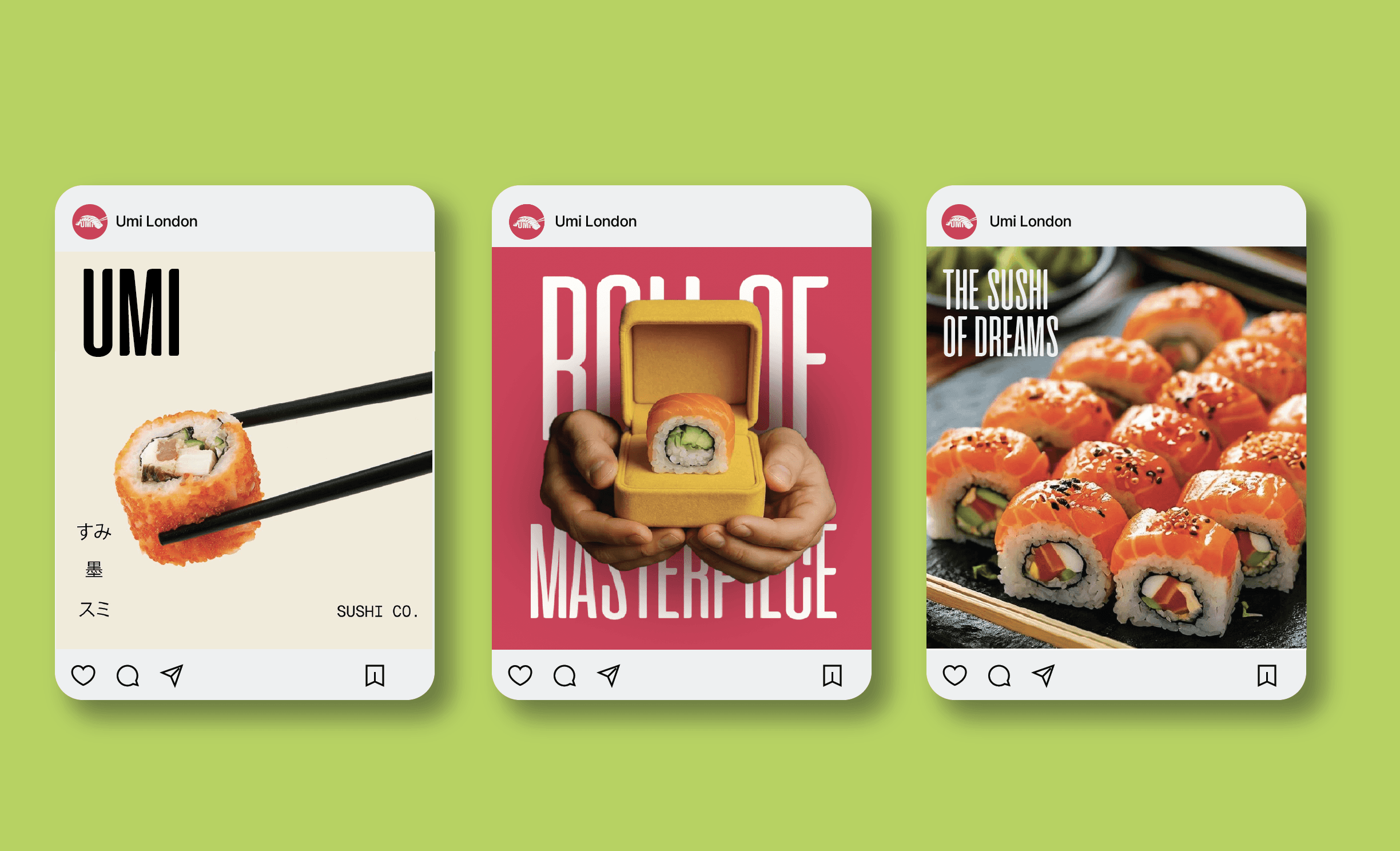
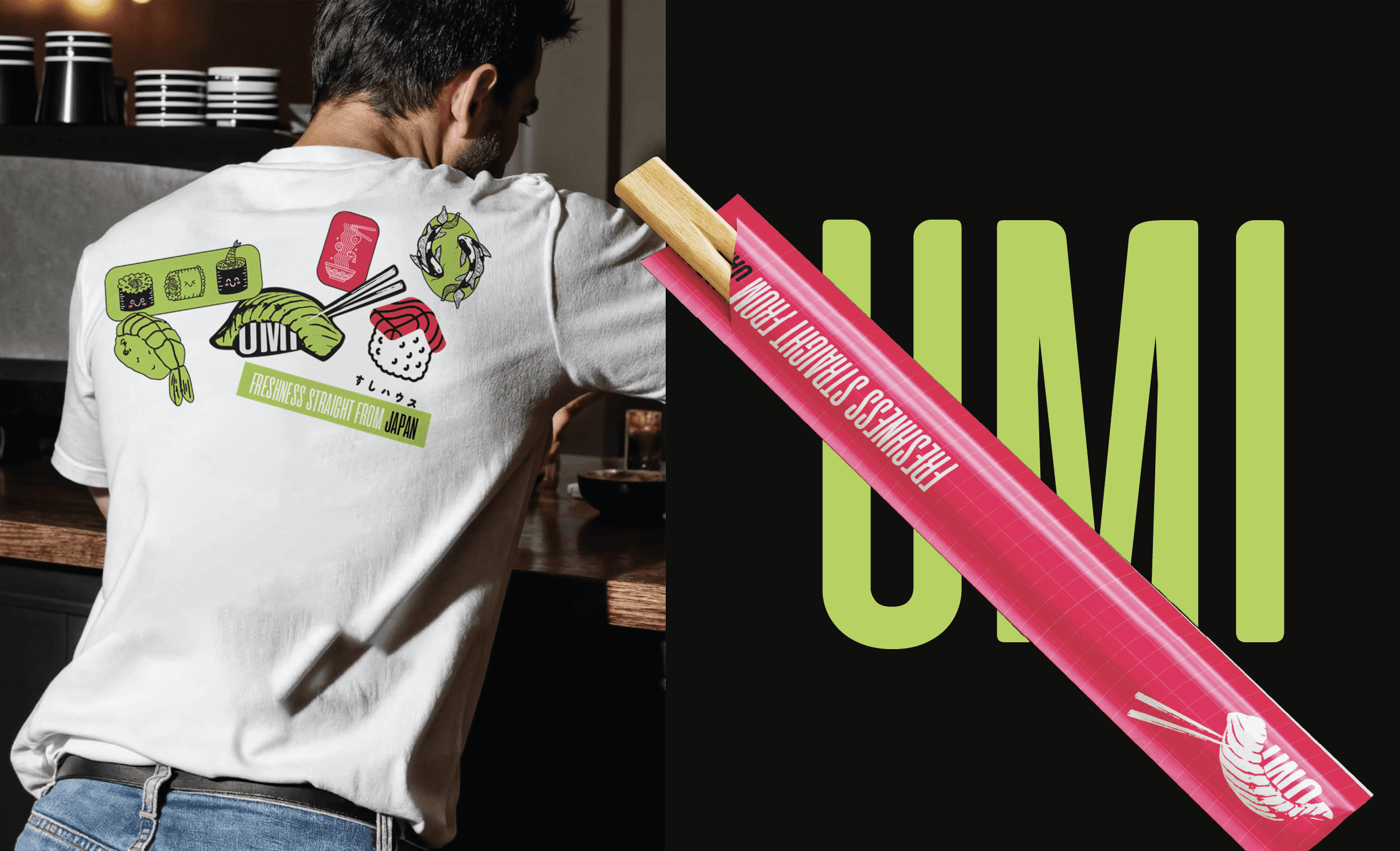
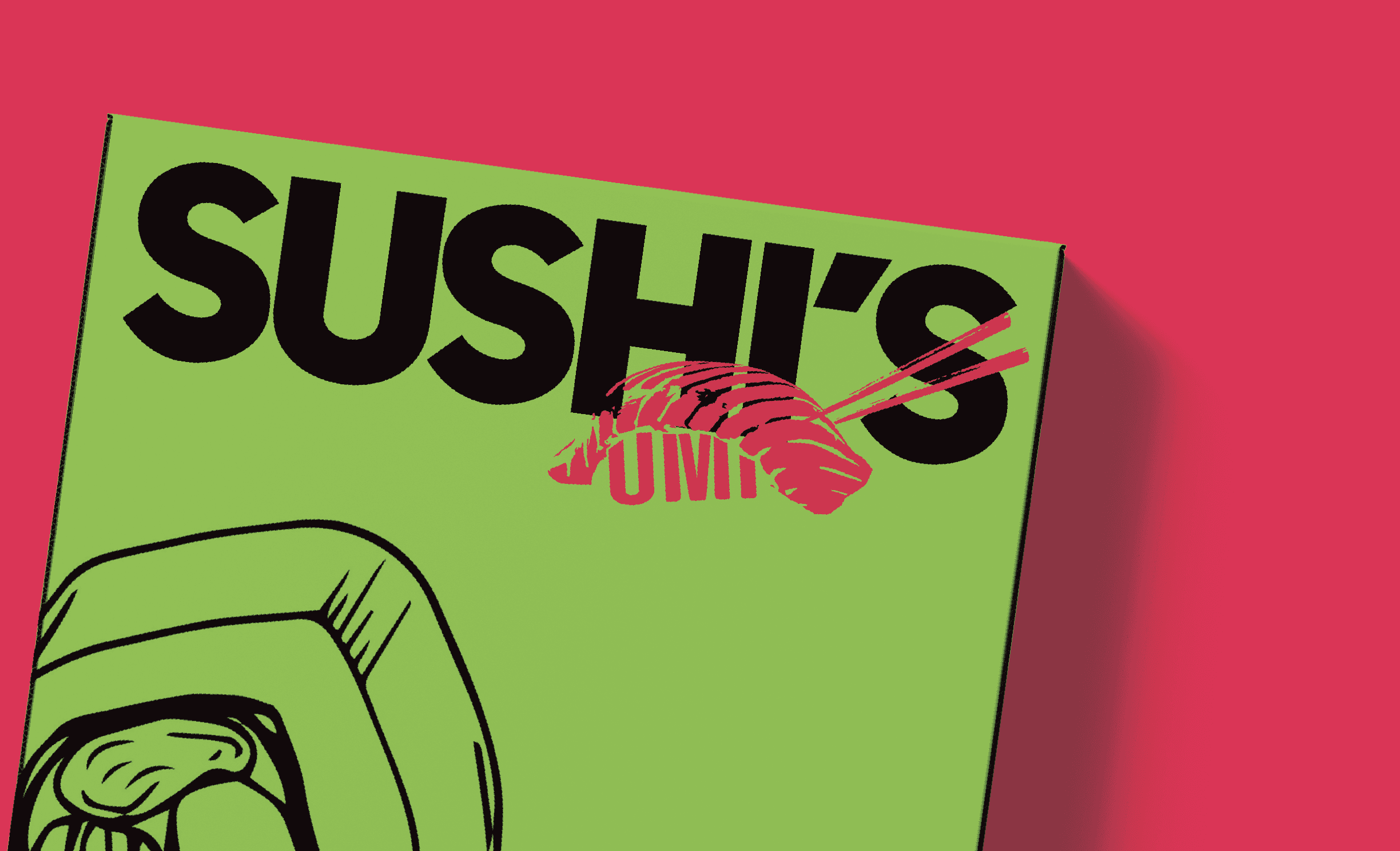
Forget “less is more”, sometimes more is magic. Umi Sushi is my take on controlled chaos: a detailed, hand-crafted logo full of texture and movement, balanced by clean visuals and bold, unapologetic color. The logo draws inspiration from traditional Japanese woodblock printing rich in strokes, organic forms, and imperfect beauty. The sushi illustration carries a sense of handmade authenticity, while the chopsticks slice through the frame, adding motion and rhythm to the composition. The typography is tall, confident, and modern standing strong against the chaos, much like the discipline behind Japanese craftsmanship. The contrasting color palette of vibrant coral red, soft beige, and lively green mirrors the essence of sushi itself freshness, boldness, and balance. It’s sushi branding, but make it art.